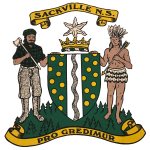
The Sackville Logo
 We haven’t been able to find much history about the Sackville logo and so we would appreciate your help. If you know anything about the Sackville logo then please contact Paul Russell at prussellster@gmail.com
Here’s what we are sure of:
The logo was used on the Sackville Flag, and a number of these flags were sold by Fultz House. Unfortunately the company that made the flag has gone out of business, and so we’ve lost the history of who placed the order.
This logo was also used on an old crest by the Sackville Fire Department. A couple of the fire department patches can be seen in the board room of the Metropolitan Ave fire station.
The parts of the logo are:
- The lumberjack, which signifies the long history that Sackville has with the lumber industry. This includes both the Barrett and the Hefler families.
- The other person is intended to be a Mi’kmaq person. There seems to have been some controversy about this person since the characteristics of the drawing is different than the tribe that was located near Sackville.
- The shield in the middle, with a depiction of the Sackville river flowing down the middle.
Here are some things we aren’t sure of:
1) “Pro Gredimur” is roughly translated from Latin to mean “We move forward”, which certainly describes what we are trying to do at the Sackville Community Development Association.
2) The colours of the logo are representative of the forest and the significant history of the lumber industry in Sackville.
3) The crown seems to have the letters SNSNSN underneath it, which could indicate Sackville, Nova Scotia, repeated.
4) The white flower could be a lily or daffodil.
5) The logo seems to have been developed by the Sackville Chamber of Commerce, which is distinct from the Sackville Business Association.

Recent Comments